
Energy Calculator
See how much you could save on energy costs with our easy-to-use LED Energy Calculator.
Open Energy Calculator
Sectors
We design and manufacture an extensive range of luminaires for a diverse number of sectors and applications. Whatever the shape, purpose or style of your space, we have a lighting solution.
View all sectors & applications
OCTO
OCTO delivers the complete smart lighting package to transform the efficiency and ambience of commercial and residential spaces.
OCTO Smart Lighting Brochure
Energy Calculator
Find information regarding our product warranty, product data downloads and FAQs regarding lighting and technical terms. Here you will find support with training CPDs as well as useful lighting design and LED strip calculators.
View the Energy Calculator
About Us
View our latest product, OCTO smart lighting and application sector brochures.
Download our BrochuresColour rendering – Colour Quality Scale (CQS)

In the years since CRI came into common use, some within the industry had commented that as the standard format of colour rendering, CRI creates several issues, possibly more than it should. When researchers at CIE created CRI, of course, the world was a different place, with colorimetry being a new science, and they attempted to describe something some people considered that as being subjective.
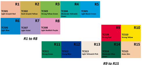
Although the CIE has defined 14 reference colours, only the first 8 are used to calculate CRI. The result is the average, Ra, based on the results R1 to R8. The 8 colours are deemed to be representative of most objects, however, in fact they are medium-chroma pastel colours, that is those with low saturation, whilst the remaining six colours, including the high-saturation colours of red, yellow, green, blue, as well as skin colour and olive green are not used to influence the calculation of CRI.

Enter the second part of this three part editorial and specifically the term of Colour Quality Scale, which was developed by the National Institute of Standard and Technology (NIST) with the aim of improving the methodology of the CIE, Colour Rendering Index, by retaining all the good parts of CRI with its relationship with the real environment and in its use of a standard colour, alongside the consideration of the parts relating to the selection of standard colours and the process used to achieve the results. Next was to contemplate how to provide the achieved result and it was thought that the easiest solution was to retain that from CRI, a single digit value, allowing ease of change from one metric to another, even though the amount of resultant information is much greater with CQS to than with CRI.
The method for calculating the Colour Quality Scale is derived from the sample test method used in the CIE Colour Rendering Index, where the colour difference is a measurement of a standard set of sample colour when being illuminated by a test light source and the reference illuminant, however, where the CRI method is based upon a pallet of just 8 colours, all of which are of low to medium saturation, and where the colour pallet was not considered to adequately span the range of normal object colours. The Colour Quality Scale has been designed to provide a solution to add to the limitations of Colour Rendering Index, whilst continuing to maintain the consistency of CRI’s values for existing light sources. This situation may result in some light sources having the ability to render colour well with colours of low saturation, which might not perform adequately with more highly saturated colours.
The CQS scale developed by the National Institute of Standard and Technology concluded that when taking the unsaturated colours and saturated colours separately, light sources which perform well under lower saturation may not do so under higher saturation, but light sources which perform well under higher saturation will also do so under lower saturation, thereby providing a more accurate scenario.
The method for CQS is based upon a palette of 15 Munsall sample colours which were selected to overcome the limitations of CRI, where it disadvantages light sources which show increased object saturation when viewed against the reference illuminant. To remove this potential issue, CQS includes observer preference, which includes the difference between that of colour or shade and that of saturation, requiring a whole new method of calculating the value of colour rendering, that being ‘CIELAB’, which is defined as CIE ‘Lab’, where it expresses the colour as three values, firstly, ‘L’ for perceptual lightness, ‘a’ and ‘b’ for the four unique colours of human vision.
The 15 Munsall Colours have the following hue value/chroma = 7.5P4/10, 10PB4/10, 5PB4/12, 7.5B5/10, 10BG6/8, 2.5BG6/10, 2.5G6/12, 7.5GY7/10, 2.5GY8/10, 5Y8.5/12, 10YR7/12, 5YR7/12, 10R6/12, 5R4/1, 7.5RP4/12 and were selected as providing the highest chroma values, whilst covering the whole of the circle of hue with approximate equal spacings. From the diagram above, it can be determined that the value of R9 (Strong Red) and R12 (Strong Blue) are highly saturated values from either end of the electromagnetic spectrum, alongside R10 (Strong Yellow) and R11 (Strong Green), being located more towards the centre.
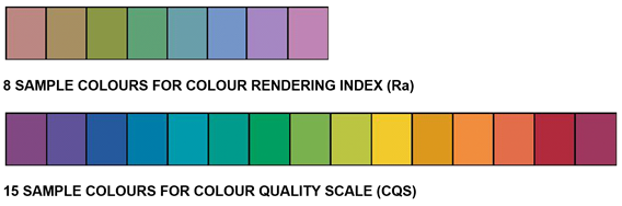
A way of simply demonstrating the difference between that of CRI and CQS is to look at the diagram below where the top row provides the 8 sample colours for CRI and the bottom row, the 15 sample colours for CQS.
Colour Quality Scale is a quantitative measure of the ability of a light source to reproduce the colours of objects being illuminated by that light source. The output of CQS is a resultant score made up from elements incorporating the ability of a light source to accurately render the colour of objects, to allow precise discrimination between the different colours and display the colours in a format which is deemed as being aesthetically and visually pleasing to the person viewing the object. One of the deviations of CQS over CRI is that of considering highly saturated colours and where the value of CRI takes little account of variance in chromatic saturation of the test light source as compared with the reference illuminant, CQS considers increases in chroma as being positive, in that it provides additional benefit in visual clarity and increases perceived brightness, with the lamp only having detrimental colour rendering effects from a variance in colour or shade or a reduction in chroma.
You Might Also Be Interested In...
